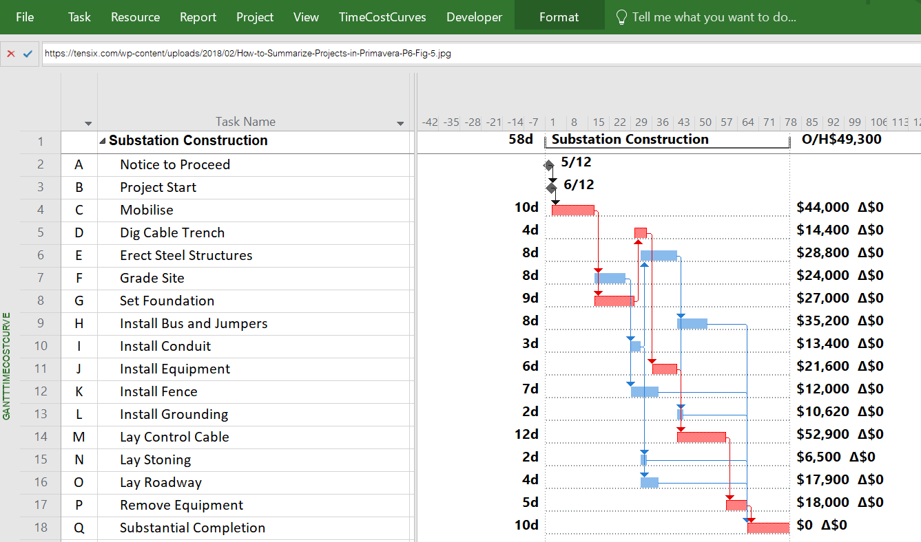
Case
Study – Substation Construction Plan as per P6 Example

| prepare your: |
gives you these options: |
|
With tccB01 (.MPP file), you have access to utility
data for activities. This case study data is available through the
WYSIWYGcrowdsourcedutilitycurves online google
sheet |
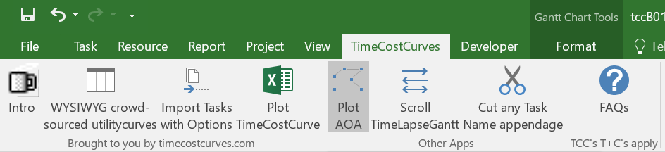
Figure 1: Button to Plot TCC’s Activity-on-Arrow Chart
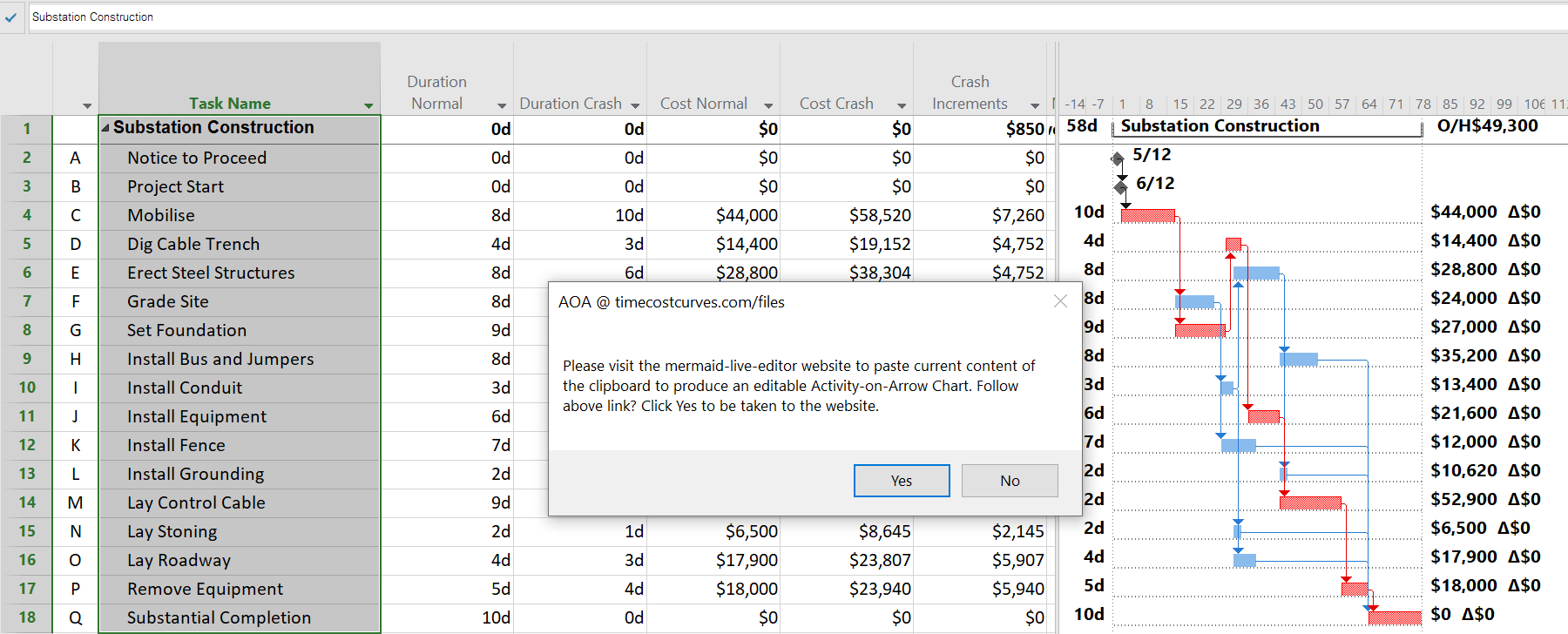
Figure 2: Userform for selection
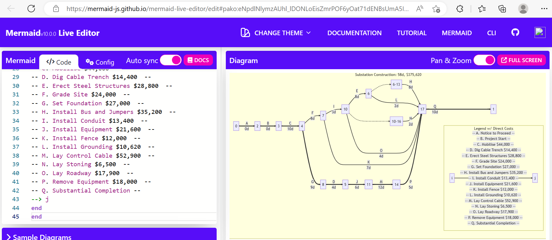
Figure 3: AOA Chart produced via Mermaid Live Editor
|
gives you these options: |
Gantt Chart preparedClick x3 |
With tccB01 (.MPP file), you have access to utility data
for activitiesIn a few clicks, you have a schematic network
model of the project |
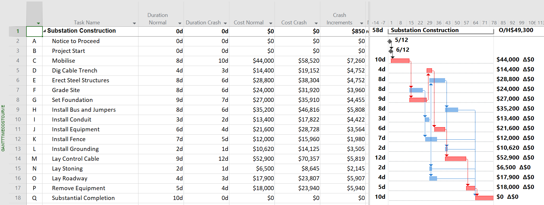
Figure 4: Utility data assumed based on P6 example with progress
update at approx. 10% complete
| prepare your: |
gives you these options: |
Gantt Chart with (minimum) 2 options per
activity: |
With tccB01 (.MPP file), you have access to utility data
for activities |
Normal Duration and Crash
Duration |
User can import activities with preloaded utility
data of <= 20 options per activity |
Normal Cost and Crash Cost |
User can define their own utility options or make
use of preloaded options. |
Indirect time-related overhead cost per
Project |
Privacy of utility data available if User assigns
percentages rather than actual durations and
costs |
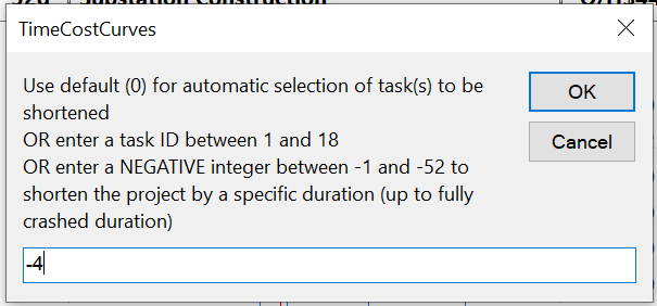
Userform with options to plot your TimeCostCurve
For example, in this case, user input ‘-4’ to shorten the project by
4 days |
 |
Resulting TimeCostCurve, with these notes
Indirect costs assumed to be $850/day is not large enough to
reduce the total project cost as it’s duration is being
compressed. To compress by 2 days, activity ID 11 (Install Equipment) is
compressed To further compress by 2 more days, activity ID 8 (Set
Foundation) is compressed To further compress by 1 more day, activity ID 5 (Dig Cable
Trench) is compressed To further compress by 3 more days, activity ID 14 (Lay Control
Cable) is compressed To further compress by 1 more day, activity ID 17 (Remove
Equipment) is compressed To further compress by 2 more days, activity ID 4 (Mobilise) is
compressed All-Normal schedule is 58 days, $375,620
VS Fully-crashed schedule is 47 days, $445,837 |
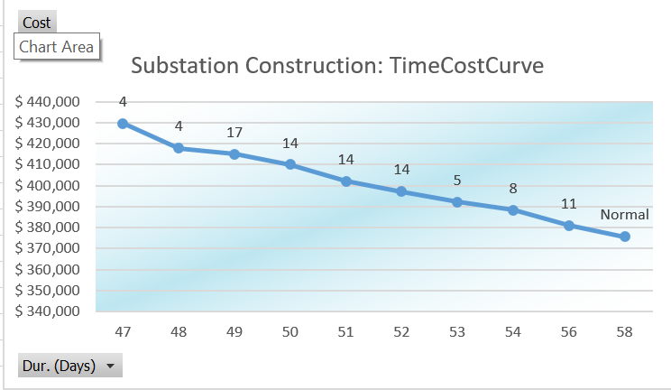 |
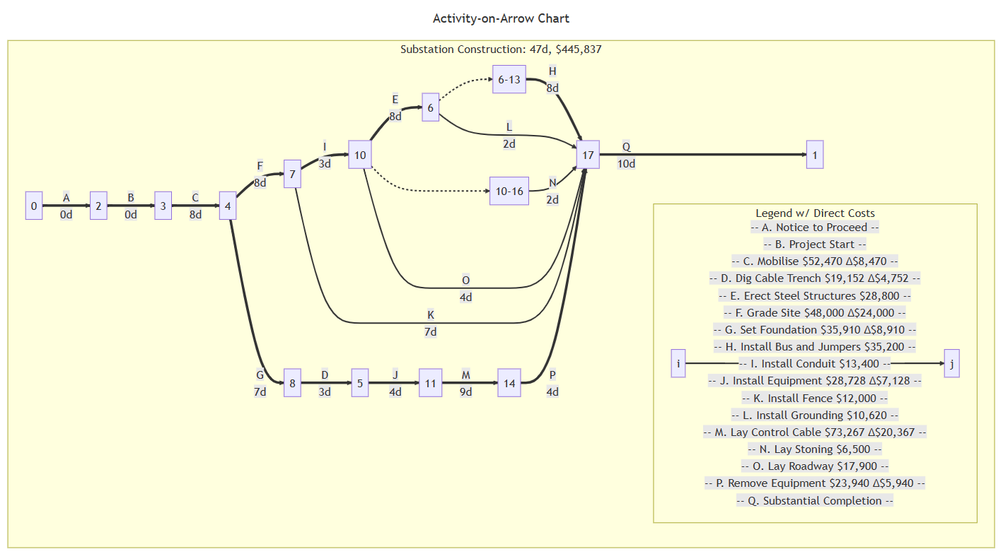
Figure 5: note the differences between this fully-crashed network
diagram and the all-normal network (Fig. 3) |
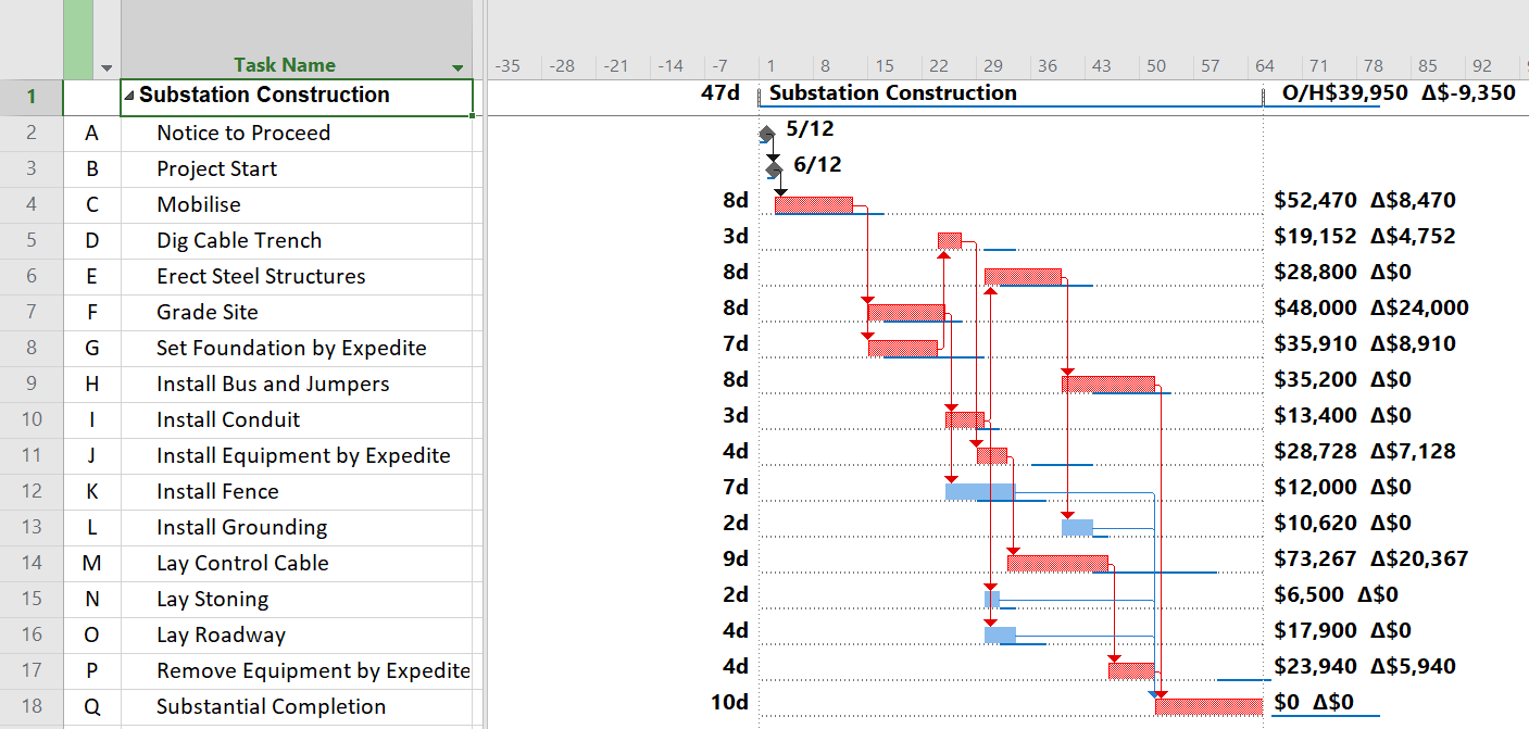
Figure 6: Fully-crashed schedule
|
gives you these options: |
| …should really check out |
Run the timecostcurves app (within tccB01.mpp file)
to plot the time-cost curve in MS Excel. Selection of tasks can be
automatic or manualSketch your project’s network model
(Activity-on-Arrow) |
You just GOTTA get:
tccB01.mpp from timecostcurves.com |
has just helped you
Solve your Time-Cost Problem
Saving Days and Dollar$ on your next Project…all in a few
clicks |